Apple’s Support Redesign


Duration
Apr 2019 - Jan 2020

My Role
Lead Product Designer

Team
1 UX Researcher, 1 Design System Manager, 1 Product Manager,
8 Front-end Devs, 5 Backend Devs,
1 Accessibility Manager, 5 QA Testers

Deliverables
Web + mobile UI
Interaction Designs
Design System Guidelines
A11y Compliance

Tools
Sketch
Principle
Html + CSS
JIRA

Contact Apple’s Support, Apple’s largest application needed to be upgraded with the latest design system, improve usability for 15 million users, and connect them to live agents via iMessage to help minimize attrition and increase conversions by finding the right solutions.

 
Background-Apple_2.png
 

Apple’s largest Support platform needed an upgrade.

Apple’s largest, most complex Support application, routes 15mil users a month to customer service for all product support needs.

The platform operated on a legacy design system and backend code base. This caused inconsistent UI, poor navigation, broken functionality, and minimal accessibility.

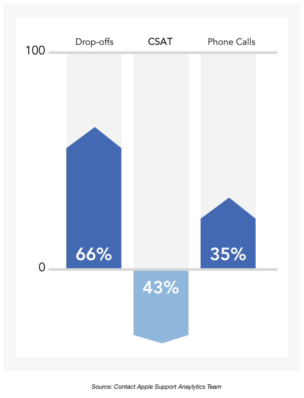
User’s inability to find the right solutions online resulted in a 66% increase in drop-offs which caused a 35% increase in customer service calls, and a 43% decrease in overall customer satisfaction.


Improving functionality
and styling across components

Our main goals were to improve broken functionality that impacted navigation, Search, modal transitions, form handling, and so forth.
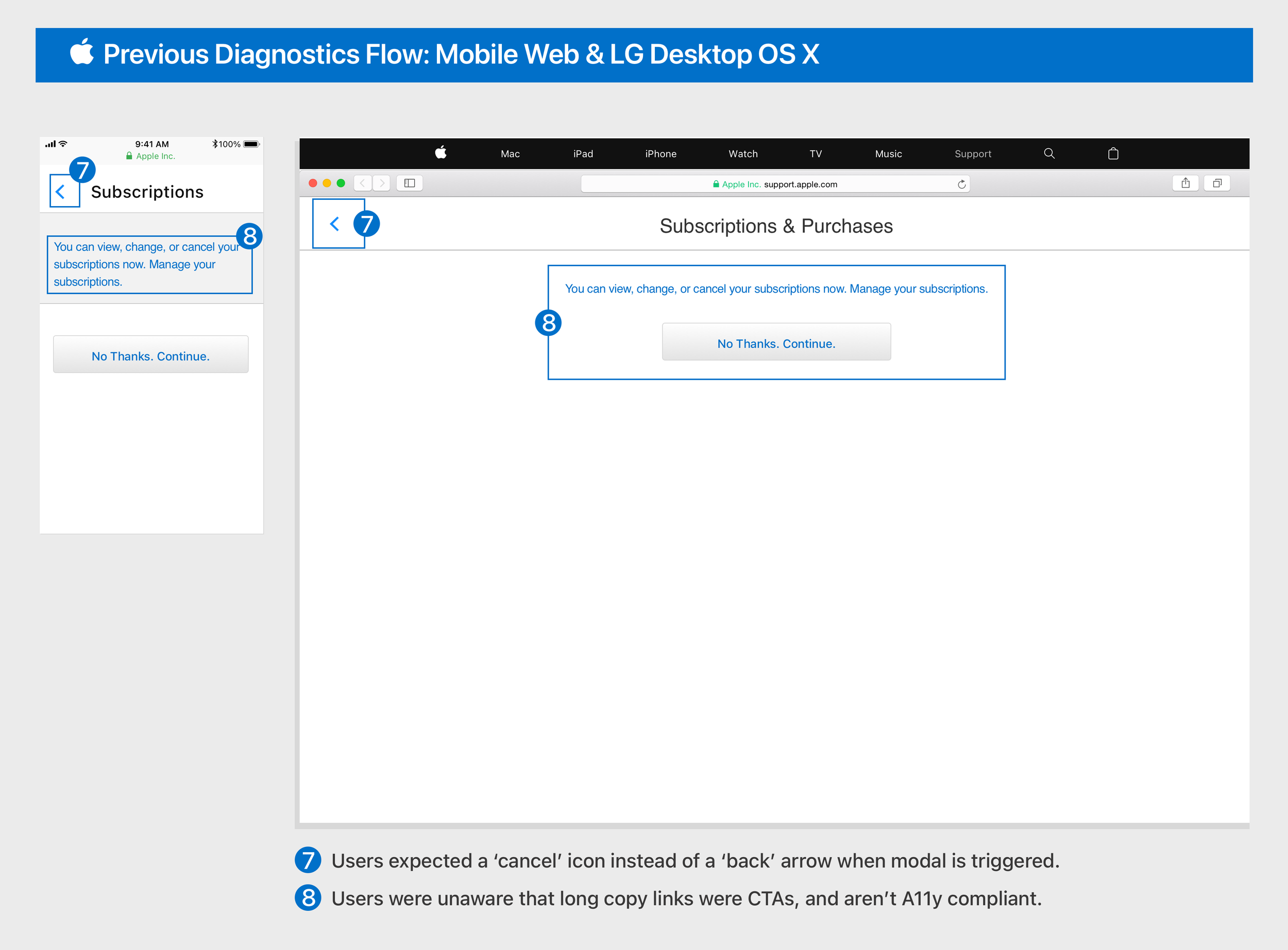
A redesigned interaction of adding more prominent borders and click states to the tile buttons, implementing a cancel icon to modals, and transforming long-copy links into tile buttons to meet A11y compliance.


background clr (1).png
 

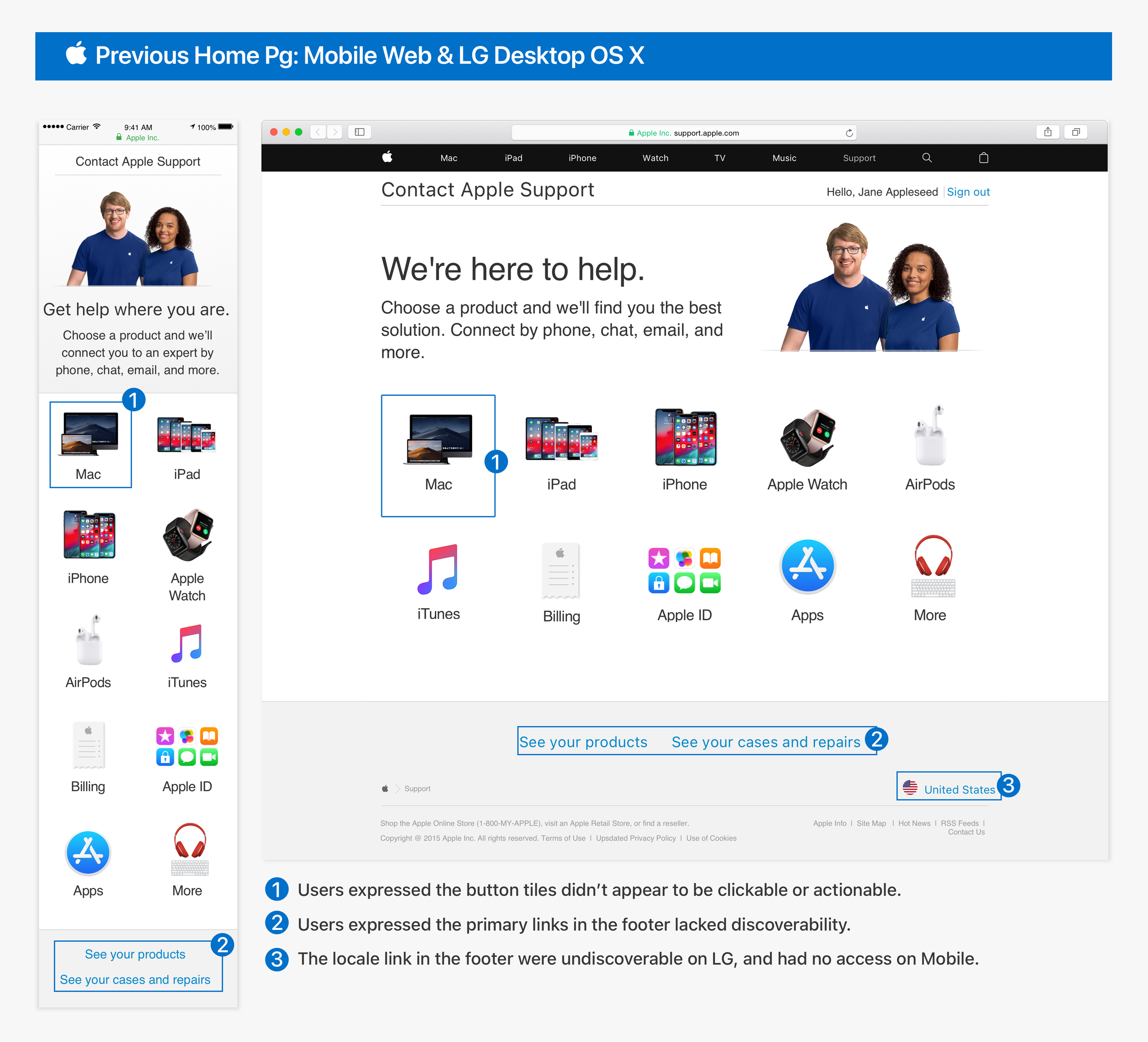
Users informed us of the primary
moments of friction across the app.

I partnered with our researcher to conduct a usability study of the previous application on actual users remotely.
We sampled 12 users from our loyal customer base which ranged from ages 25-65yrs old. 

A few examples from extensive user feedback, we were able to assess which friction points could be used as a reference
to improve the overall information architecture, content, functionality, and interactions of the entire app.


Taking inventory and creating new
style guidelines.

I collaborated with our Design System Manager to take inventory of each page for all font styles, colors, icons, and referenced a11y compliance for color contrast. We then created a
cohesive style guide with Apple’s latest design system.


background clr.png
 

Improving Search Functionality

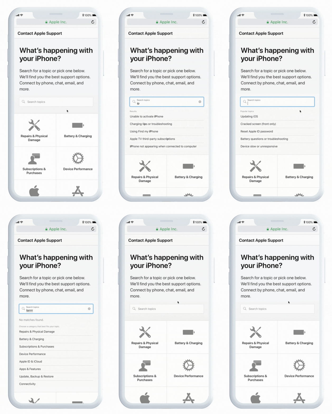
The Search bar was one of the most critical interaction functionalities we needed to improve to empower our users to find the right solutions.


Default state

Default state

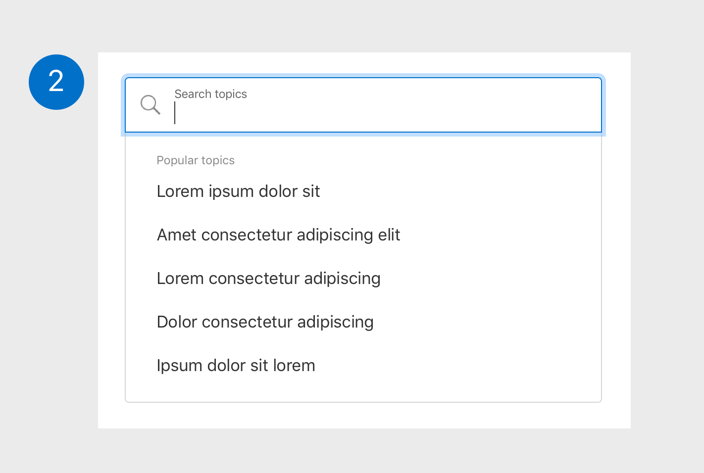
Selector focus state: outline highlighted with color #83C0FD, 4px wide. Dropdown of popular categories appears.

Selector focus state: outline highlighted. Dropdown of popular categories appears.

Reset [x] icon appears upon type input. Category list re-populates based off of input in search bar.

Reset [x] icon appears upon type input. Category list re-populates based off of input in search bar.

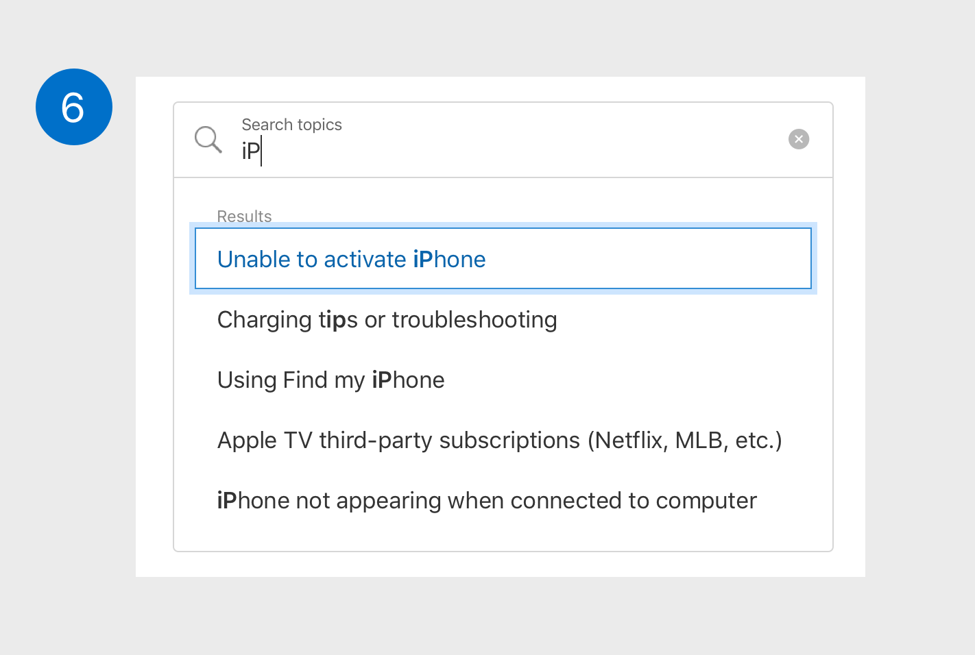
Categories highlight to link color #0079C9 on hover.

Categories highlight to link on hover.

When selecting via the tab key, focus on the [x] icon is highlighted with outline #83C0FD, 4px wide.

When selecting via the tab key, focus on the [x] icon is highlighted with an outline.

Native focus state: categories selected via the tab key with same outline styling as search bar in it’s selector state.

Native focus state: categories selected via the tab key with outline highlighted.

Mis-spelled text inputs trigger a ‘No matches found’ message, and a recommended category list.

Mis-spelled text inputs trigger a ‘No matches found’ message, and a recommended category list.


Connecting users to live agents
for faster support.

To expedite issues, we connected mobile users to real Apple Support agents
by implementing a chat feature via iMessage.

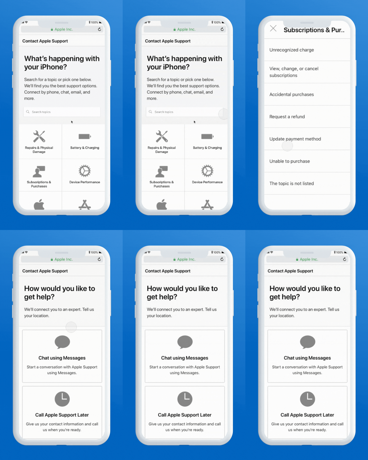
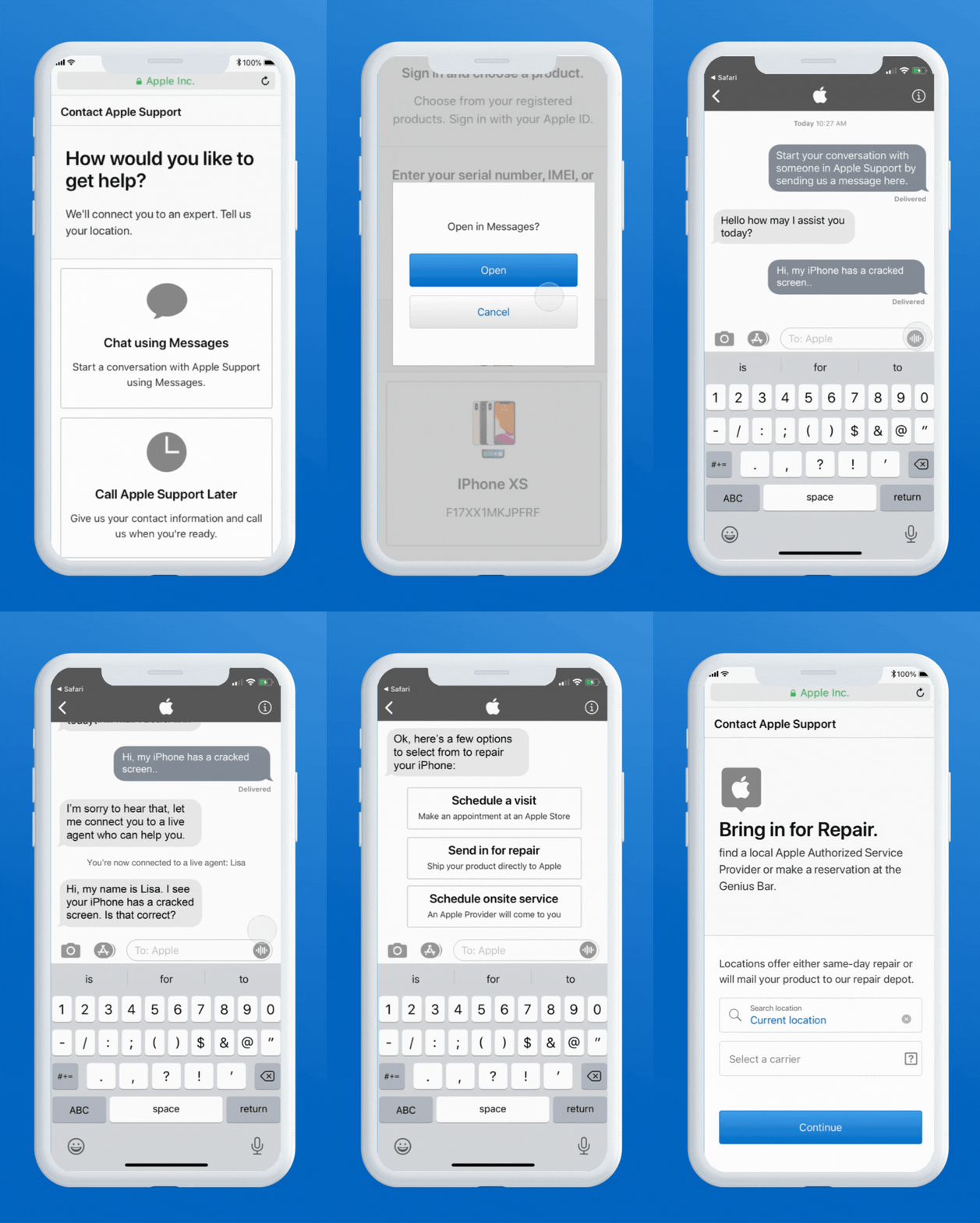
I mapped out the conversational site flow with an entry from the contact and product selection web pages to launching the chatbot that routes users to the right live agent based on their issue.

Once connected, a live agent will ask to authenticate, validate, and provide the right resources within the chat, direct links to solutions online, alternative pathways to diagnosing what the issue is, or call customer service as a last resort.

I created a prototype depicting the happy path of starting a conversation with a chatbot to describe the issue of having a cracked screen. 

After the chatbot authenticates, the customer waits in the queue to be routed to the right live agent who then confirms their issue, and provides helpful online options of how to repair their device, minimizing the number of steps it would take online.


background clr.png
 

Apple Support’s Redesigned Experience

Taking a dual web & mobile web approach, I improved the IA, components, form handling, style and interaction guidelines, accessibility, and functionality of the entire Support experience to ultimately route users to the right product solutions more efficiently.


Measuring the redesign’s impact on our users, and the organization.

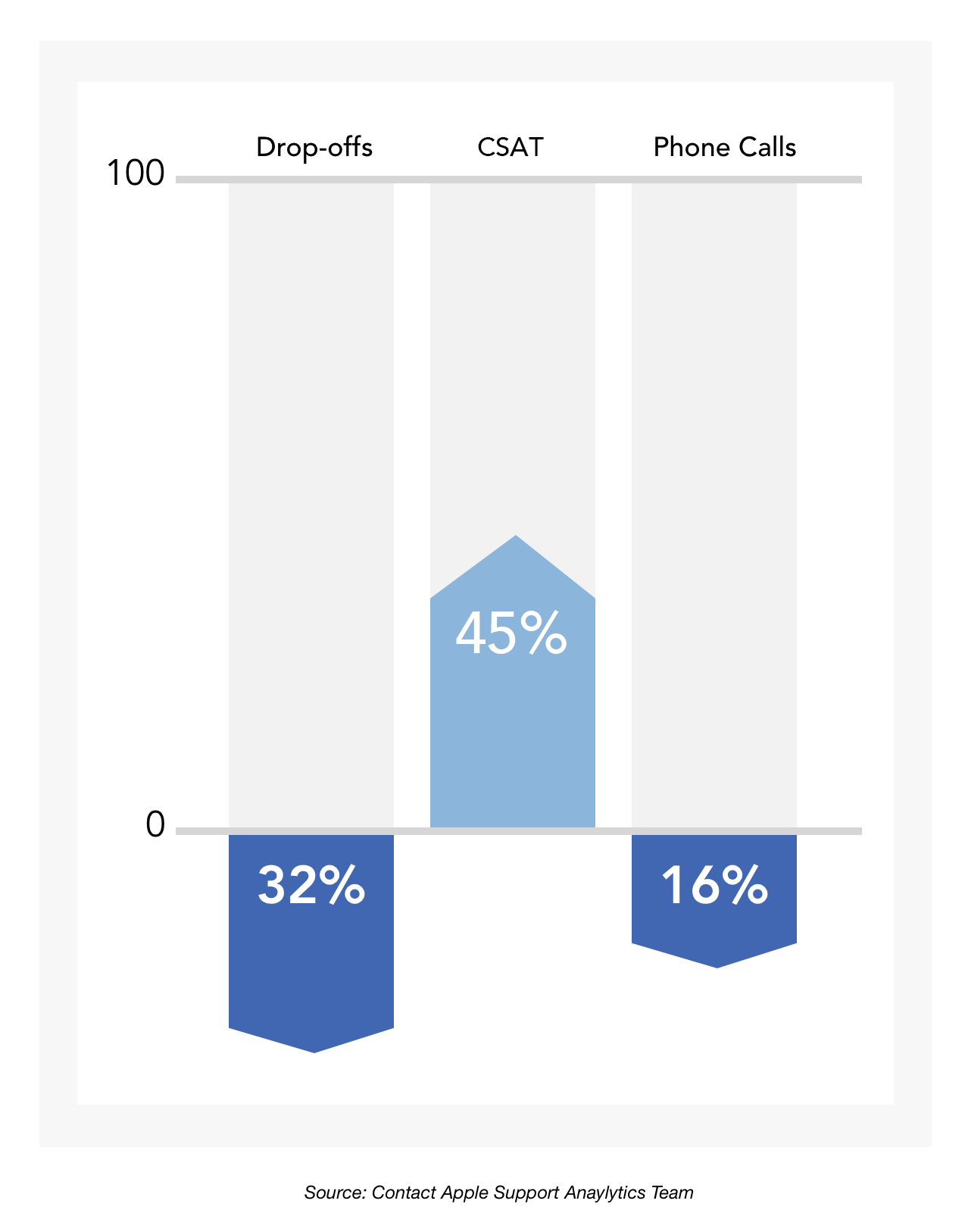
After launch, these improvements already helped to retain more users throughout the experience. 

The drop-off rate decreased by 32%, which decreased the amount of customer service phone calls by 16%, and increased overall customer satisfaction by 45%. 

This resulted in a big win for our users, and the organization at large.

Other Projects